It's not just wasted space anymore
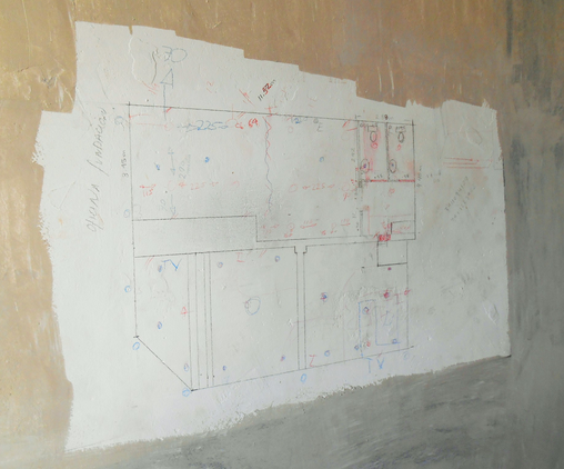
I wrote two books on home design and in both volumes railed against circulation area as wasted space. I advocated highlighting circulation area in home plans and calculating the percentage of total living area devoted to “passing through.” If the total equaled or exceeded 9%, I advocated a total redesign of the plans.
I was proud of designing blueprints with less than 6% circulation area, which is tough to do. But I had never considered how much pleasure a hallway can provide when thgoughtfuly designed.
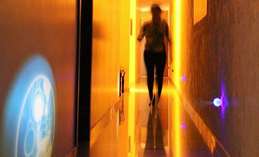
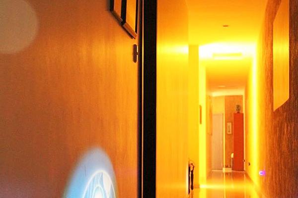
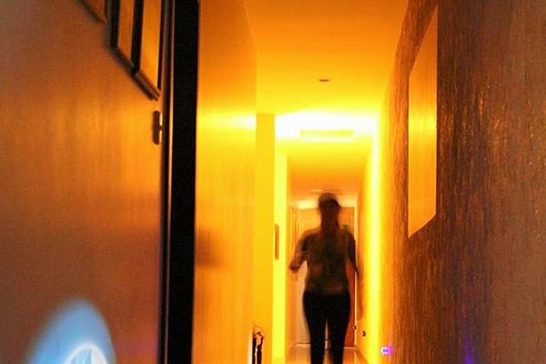
I happen to live in a home with an extremely long hallway now. At one end is an open, notched access to the living area, which works as a kind of “stage right” from which one can emerge with panache when entertaining. At the other end of the hall, a glass door leads to a charming garden and reflecting pool.
On the walls of the hall, which is about ten centimeters (4 in.) wider than a typical cow corridor and nearly ten feet tall, we have giant pictures and a family portrait gallery lining the walk.
Night lights cast interesting ghost images of galaxies on the walls.
The hallway is long enough for you to pick up speed as you walk, then trot and even jog down.
It’s now my favorite “room” in the house, and hence I use it often. I never hesitate to trot back to the master bedroom—at the very far end of the hall—to put away a pencil, or use the master bath instead of the guest bath two steps away.
I think the design lesson here is not to avoid hallways, but if you include one, to make it fun for sliding, make side entrances surprising, and make it wide enough to be a photo or art gallery.
With regards to hallways, I stand corrected (or should I say slide?)

— Fernando Pagés Ruiz is ProTradeCraft's Latin America Editor. He is currently building a business in Ecuador and a house in Mexico. Formerly, he was a builder in the Great Plains and mountain states. He is author of Building an Affordable House and Affordable Remodel (Taunton Press).
